Siena Heights University is a private Catholic University founded in the small town of Adrian, Michigan. Recently, they’ve broadened their reach to include eight additional locations and a rapidly growing online learning program. The online learning program is a primary focus of growth for the university. To make the most out of their paid advertising, social media, and content campaigns, Siena Heights turned to Human Element for help getting more of their website traffic to convert into new student enrollment opportunities.
Establishing Optimization Goals
Before getting into the optimization ideas, it’s critical to understand the goal of the page. This page has two goals. Those goals are clicking on the “Request Info” button or the “Apply Online” button. Although it’s ideal to follow a “one page, one goal” rule for your pages, many times that just isn’t possible or ideal for your website visitor. In this case, sure we could remove the “Request Info” goal and have the only goal be “Apply Now”, but from visitor research, we know that most visitors to this page are simply not ready to apply, even if they are interested. This secondary “Request Info” goal ensures that those visitors can connect with the university.
Ok, so how do we drive more visitors to these goals?
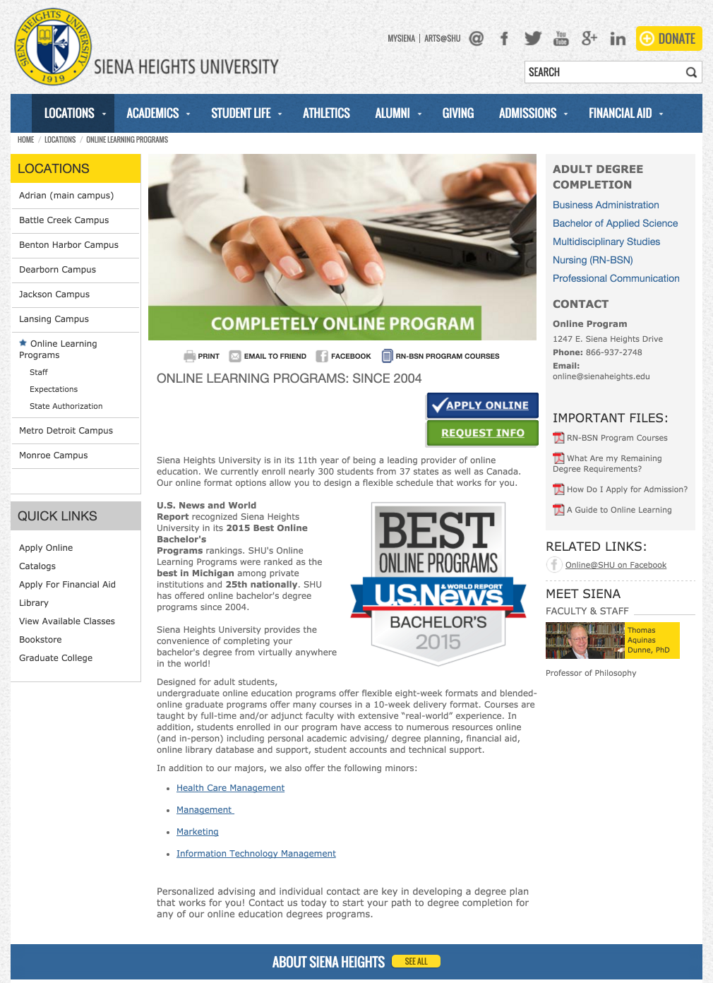
First, let’s take a look at the current page:
Here’s are the ideas we came up with
Reduce the number of links that take you off the page
Without counting the header and footer sections, the main content area of this page has 38 links that take you off of the page. We’ve already established that we have two goals on the page, why suggest 38 other places to go that do not lead to these goals?
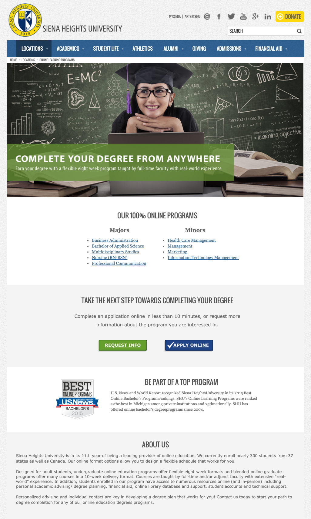
Adding a value driven headline & subheader
The current headline, “Completely Online Program” only speaks to what the Siena Heights online program is, but not why someone would enroll. Answering this question is critical to get conversions.
Improving the main hero image
Images can often be an afterthought when designing a page. It’s tough to slog through stock image sites for something unique, and coming up with images internally is always a challenge. An great image that helps the website visitor see their desired outcome in their mind is a huge driver of motivation.
Moving to a one-column layout with additional whitespace
When designers talk about needing whitespace, it’s not just because is looks pretty. Proper use of whitespace allows the important content to be featured and not drown in the noise.
Typically, we would pick one of these elements, create test hypothesis, and test the variation against the original. This way we can isolate which had the most & least impact. But, instead in this situation we decided to test a wholesale redesign of the page including all of these elements for maximum impact. Testing this way allows for quicker results, and less chance of an inconclusive results (the reason why a lot of people give up on A/B testing).
With that in mind, here’s what the variation we created:
So what were the results?
An 82% increase in “Request Info” conversions with 97% statistical significance.
Not bad, huh? Better yet, many of the changes we made can be duplicated to the dozens of other similar pages on the Siena Heights website, resulting in higher conversions across the board.
Is this the perfect page? No way. That’s why we’ll continue to test and look for improvements. What would you change or add to this page to increase conversions?
